
A flat label design tells you almost nothing. You can’t see where the logo lands when the can curves away, whether the ingredient text disappears around the side, or how the whole thing reads on a shelf next to six competitors. A 3D can mockup answers all three in about the time it takes to make coffee.
This walkthrough covers the full process — preparing artwork, wrapping it on the can, getting the lighting to behave, and exporting something you can actually put in front of a client. No Photoshop, no 3D software.
What a 3D can mockup is (and why flat previews mislead you)
A 3D can mockup wraps your label artwork around an actual three-dimensional can model, then renders it with real lighting and reflections. You can spin it, change the metal finish, drop in a background, and export a still image or a short animation.
The difference from a flat PSD mockup matters more than people expect. A PSD template distorts your label using a fixed displacement map baked from one photograph — one angle, one lighting setup, forever. A 3D model recalculates the curve and the specular highlights each time you rotate it. Move the can, and the reflection moves with it.
That’s the bit clients notice, even if they can’t name it.
Before you start: get your label artwork right
Most bad can mockups are bad because of the artwork, not the tool. Sort these out first.
Work flat, at the right proportions. A standard 355 ml (12 oz) can body has a label area roughly 200 mm wide by 105 mm tall before seam allowance. A 250 ml sleek can is narrower and taller. Design at these proportions or your type will stretch when it wraps.
Keep critical content out of the seam zone. Roughly 10 mm on each edge of your flat artwork ends up wrapping toward the back and overlapping. Barcode, net weight and legal text belong on the back panel — not near the seam.
Export PNG at 300 DPI. JPG works but you lose the option of transparent areas showing the bare aluminium underneath. Which brings us to the single most common mistake:
Decide early whether you want printed metal or a full-coverage label. Beverage cans are often printed directly onto aluminium, so white areas of your design need actual white ink or the metal shows through. If your artwork has a transparent background and you want that brushed-metal look coming through, keep it transparent. If not, flatten to a solid background.
Step by step: building the mockup
1. Open a can template
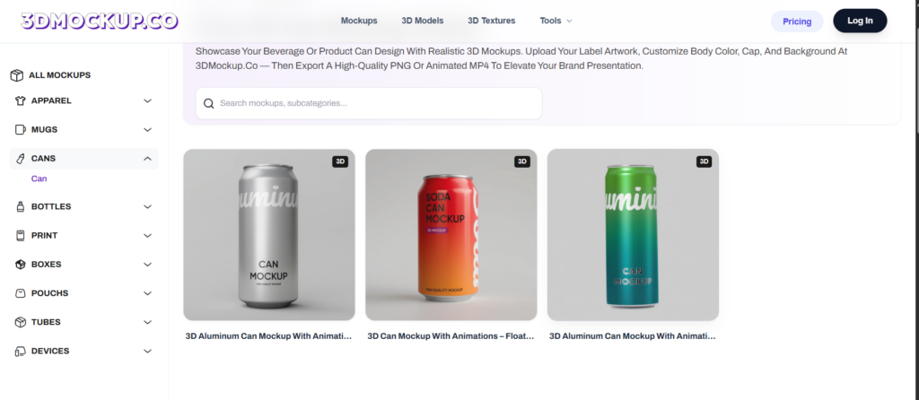
Head to the 3D can mockup templates and pick a body shape. Standard, sleek and slim cans read very differently — a craft soda on a slim can looks premium, the same artwork on a stubby can looks like an energy drink. Choose before you upload, because switching later means repositioning everything.
2. Upload and position the label
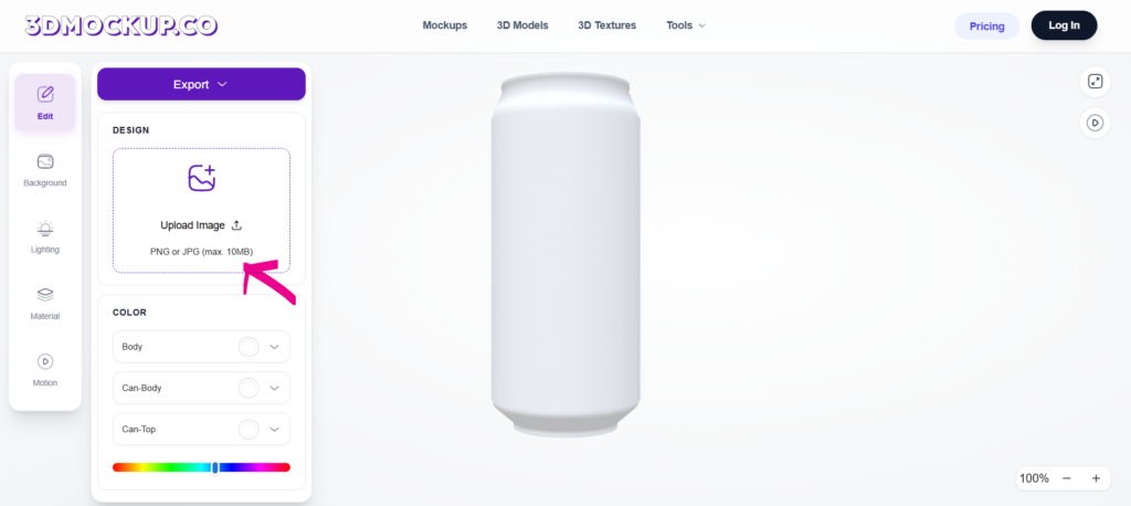
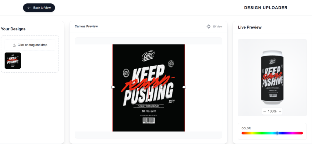
Drop your PNG in. The tool wraps it around the cylinder automatically, and you nudge scale and vertical position from there.
Watch two things as you position. First, is the logo centred on the *front-facing* arc, not on the flat artwork? Those aren’t the same point once it wraps. Second, does any text cross the top or bottom curve? Type that runs into the shoulder of the can bends in a way that looks like a printing defect.
3. Set the can finish
This is where a 3D can mockup earns its keep. Glossy aluminium throws hard, bright reflections and suits soda and energy drinks. Matte finishes absorb light and read as craft, natural or premium. A brushed metal texture sits in between and works well for beer.
Try all three. It takes seconds and the same label can look like three different products.
4. Choose a background
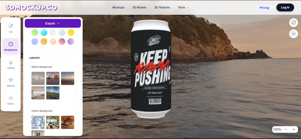
Plain gradients for e-commerce listings — Amazon and most marketplaces want a clean background anyway. Lifestyle scenes for social and ads. If you’re building a range, use one background across every can so the set looks like a set.
5. Rotate and check the sides
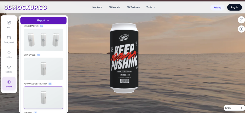
Spin the can before you export. Every time. This is where you catch the ingredient panel colliding with the logo, or a gradient that banded when it wrapped. Fixing it now costs a minute; fixing it after the client has seen it costs a lot more.
6. Export
PNG or JPG for stills. For a rotating animation, switch to the motion option, set the speed, and export MP4. A four-second spin is usually the sweet spot for social — long enough to show the full label, short enough that nobody scrolls past.
Still vs animated: which do you actually need?
| Use case | Best output | Why |
| Amazon / Shopify listing | Still PNG, plain background | Marketplaces want clean, consistent product shots |
| Instagram or TikTok | MP4 spin, 4–6 seconds | Motion holds attention in feed |
| Client presentation | Both | Stills for the deck, animation for the reveal |
| Pitch deck / investor | Still, lifestyle background | Context sells the concept faster than a spin |
| Crowdfunding page | MP4 near the top | Video above the fold lifts engagement |
If you’re leaning toward motion, the comparison of video mockup generators goes deeper on which tools handle animation export well and which quietly stamp a watermark on it.
Five details that separate a convincing can mockup from an obvious one
Match the lighting to the finish. Bright key light on a matte can looks flat and wrong. Soft, diffused light on a glossy can wastes the reflection.
Mind the shadow. A can floating with no contact shadow reads as fake instantly. Even a soft ellipse under the base fixes it.
Don’t over-rotate. Somewhere around 15–25 degrees off dead-centre shows enough of the side to read as three-dimensional without hiding the front panel.
Check contrast against the background. A dark navy label on a dark grey backdrop technically looks moody. It also disappears in a thumbnail.
Build the whole range at once. If you have four flavours, mockup all four with identical camera, lighting and background. Inconsistent product photography is the fastest way to look like a hobby brand.
When you’d still reach for Photoshop
Browser tools handle the standard cases well. Photoshop is still worth the effort when you need a very specific compositing setup, a custom light rig, or the can integrated into an existing photograph with matching grain and colour grade. The full 3D packaging design mockup in Photoshop walkthrough covers that route.
For everything else — client previews, listing images, social posts, label iteration — the online route is faster and the output is honestly hard to tell apart.
How do I make a can mockup without Photoshop?
Use a browser-based 3D generator. Upload your flat label as a PNG, and the tool wraps it on the can model, applies the metal finish and renders it. No layers, no smart objects, no software to install.
What size should a can label design be?
Design flat at the can’s wrap dimensions — roughly 200 × 105 mm for a standard 355 ml can, narrower and taller for a 250 ml sleek. Export at 300 DPI and keep essential text about 10 mm clear of each edge.
Can I use a 3D can mockup commercially?
That depends entirely on the tool’s licence. Check the terms before you use anything in a paid campaign or on a product listing — some free tools restrict commercial use or watermark exports.
How do I make an animated can mockup?
Build the mockup as normal, then switch to the motion or animation option and export as MP4 instead of PNG. Keep it to four to six seconds for social.
Can I mock up bottles and pouches the same way?
Yes, and the workflow barely changes. The 3D bottle mockups use the same upload-wrap-export flow, though bottles need more care with transparency and liquid colour.
Conclusion
A 3D can mockup takes about five minutes once your artwork is prepared properly — and preparation is most of the job. Get the wrap proportions right, keep text out of the seam, pick a finish that matches the brand, and always spin the can before exporting.
Ready to try it? You can create a 3D mockup for free and have a finished can render before your next meeting starts.